---
title: StatusSwitchElement可切换状态的元素
---
# 属性
| 名称 | 用途 |
| -------------------- | ---------------- |
| CheckedElement | 选中时展示的元素 |
| HideUncheckedElement | 是否隐藏元素 |
# 案例
对应`xaml`中添加`HandyControl`对应的命名空`xmlns:hc="https://handyorg.github.io/handycontrol"`
## CheckedElement 选中时展开元素
此附加属性适用于`ToggleButton`以及子类控件,用于控制选择类控件选中时,显示的控件内容,默认情况为`False`不显示
```xml
```
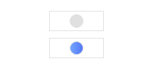
效果:
默认状态(非选中时)和选中状态
## HideUncheckedElement 是否隐藏元素
控制选中状态时是否隐藏默认元素,默认为`False`不隐藏
```xml
```
效果:

{% note info no-icon %}
以上两个属性,组合使用,能够简单的控制选择类控件状态的展示功能,可根据以上案例进行合理调整
{% endnote %}