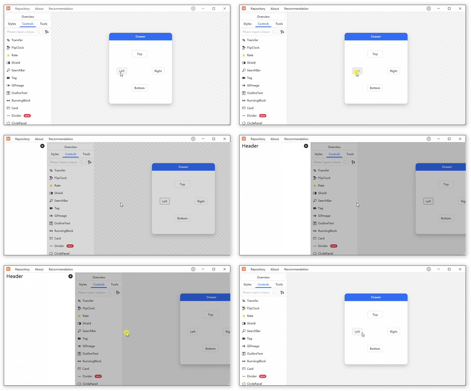
5.0 KiB
5.0 KiB
title
| title |
|---|
| Drawer 抽屉 |
当 Dialog 组件不能满足我们的需求时(例如展示一些文档),可以使用 Drawer.
[ContentProperty("Content")]
public class Drawer : FrameworkElement
属性
| 属性 | 描述 | 默认值 | 备注 |
|---|---|---|---|
| IsOpen | 是否关闭 | ||
| MaskCanClose | 点击遮罩层是否可以关闭 Drawer | true | |
| ShowMask | 是否显示遮罩层 | true | |
| Dock | 位置 | Dock.Left | |
| ShowMode | 显示模式 | DrawerShowMode.Cover | |
| MaskBrush | 遮罩层颜色 | ||
| Content | 内容 |
事件
| 名称 | 说明 |
|---|---|
| Opened | 抽屉打开时触发 |
| Closed | 抽屉关闭时触发 |
案例
<hc:SimplePanel Margin="22">
    <Grid>
        <Grid.RowDefinitions>
            <RowDefinition/>
            <RowDefinition/>
            <RowDefinition/>
        </Grid.RowDefinitions>
        <Grid.ColumnDefinitions>
            <ColumnDefinition/>
            <ColumnDefinition/>
            <ColumnDefinition/>
        </Grid.ColumnDefinitions>
        <ToggleButton Margin="10" HorizontalAlignment="Stretch" Grid.Row="1" Grid.Column="0" Content="Left" IsChecked="{Binding IsOpen,ElementName=DrawerLeft}"/>
        <ToggleButton Margin="10" HorizontalAlignment="Stretch" Grid.Row="0" Grid.Column="1" Content="Top" IsChecked="{Binding IsOpen,ElementName=DrawerTop}"/>
        <ToggleButton Margin="10" HorizontalAlignment="Stretch" Grid.Row="1" Grid.Column="2" Content="Right" IsChecked="{Binding IsOpen,ElementName=DrawerRight}"/>
        <ToggleButton Margin="10" HorizontalAlignment="Stretch" Grid.Row="2" Grid.Column="1" Content="Bottom" IsChecked="{Binding IsOpen,ElementName=DrawerBottom}"/>
    </Grid>
    <hc:Drawer Name="DrawerLeft" Dock="Left" ShowMode="Push">
        <Border Background="{DynamicResource RegionBrush}" Width="300" BorderThickness="0,1,0,0" BorderBrush="{DynamicResource BorderBrush}">
            <Grid>
                <Grid.RowDefinitions>
                    <RowDefinition Height="Auto"/>
                    <RowDefinition/>
                </Grid.RowDefinitions>
                <TextBlock Margin="10,0,0,0" Text="Header" Style="{StaticResource TextBlockTitle}" HorizontalAlignment="Left"/>
                <Button Command="hc:ControlCommands.Close" Grid.Row="0" HorizontalAlignment="Right" Foreground="{DynamicResource PrimaryTextBrush}" Style="{StaticResource ButtonIcon}" hc:IconElement.Geometry="{StaticResource DeleteFillCircleGeometry}"/>
            </Grid>
        </Border>
    </hc:Drawer>
    <hc:Drawer Name="DrawerTop" Dock="Top" ShowMode="Press">
        <Border Background="{DynamicResource RegionBrush}" Height="300" BorderThickness="0,1,0,0" BorderBrush="{DynamicResource BorderBrush}">
            <Grid>
                <Grid.RowDefinitions>
                    <RowDefinition Height="Auto"/>
                    <RowDefinition/>
                </Grid.RowDefinitions>
                <TextBlock Margin="10,0,0,0" Text="Header" Style="{StaticResource TextBlockTitle}" HorizontalAlignment="Left"/>
                <Button Command="hc:ControlCommands.Close" Grid.Row="0" HorizontalAlignment="Right" Foreground="{DynamicResource PrimaryTextBrush}" Style="{StaticResource ButtonIcon}" hc:IconElement.Geometry="{StaticResource DeleteFillCircleGeometry}"/>
            </Grid>
        </Border>
    </hc:Drawer>
    <hc:Drawer Name="DrawerRight" MaskCanClose="False">
        <Border Background="{DynamicResource RegionBrush}" Width="300" BorderThickness="0,1,0,0" BorderBrush="{DynamicResource BorderBrush}">
            <Grid>
                <Grid.RowDefinitions>
                    <RowDefinition Height="Auto"/>
                    <RowDefinition/>
                </Grid.RowDefinitions>
                <TextBlock Margin="10,0,0,0" Text="Header" Style="{StaticResource TextBlockTitle}" HorizontalAlignment="Left"/>
                <Button Command="hc:ControlCommands.Close" Grid.Row="0" HorizontalAlignment="Right" Foreground="{DynamicResource PrimaryTextBrush}" Style="{StaticResource ButtonIcon}" hc:IconElement.Geometry="{StaticResource DeleteFillCircleGeometry}"/>
            </Grid>
        </Border>
    </hc:Drawer>
    <hc:Drawer Name="DrawerBottom" Dock="Bottom" ShowMask="False">
        <Border Background="{DynamicResource RegionBrush}" Height="300" BorderThickness="0,1,0,0" BorderBrush="{DynamicResource BorderBrush}">
            <Grid>
                <Grid.RowDefinitions>
                    <RowDefinition Height="Auto"/>
                    <RowDefinition/>
                </Grid.RowDefinitions>
                <TextBlock Margin="10,0,0,0" Text="Header" Style="{StaticResource TextBlockTitle}" HorizontalAlignment="Left"/>
                <Button Command="hc:ControlCommands.Close" Grid.Row="0" HorizontalAlignment="Right" Foreground="{DynamicResource PrimaryTextBrush}" Style="{StaticResource ButtonIcon}" hc:IconElement.Geometry="{StaticResource DeleteFillCircleGeometry}"/>
            </Grid>
        </Border>
    </hc:Drawer>
</hc:SimplePanel>