4.9 KiB
4.9 KiB
title
| title |
|---|
| RadioButton 单选按钮 |
RadioButtonBaseStyle
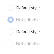
单选按钮默认样式,不推荐直接使用,应该始终被其它样式以BasedOn的方式使用。
案例:
<StackPanel>
    <RadioButton Content="默认样式"/>
    <RadioButton Margin="0,16,0,0" Content="不可编辑" IsChecked="True" IsEnabled="False"/>
    <RadioButton Margin="0,16,0,0" Content="默认样式"/>
    <RadioButton Margin="0,16,0,0" Content="不可编辑" IsEnabled="False"/>
</StackPanel>
效果:
RadioButtonIcon:RadioButtonBaseStyle
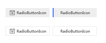
带图标样式,可只显示图标也可图文显示
案例:
<UniformGrid Margin="22,0,0,0" Rows="2" Columns="2">
    <RadioButton Margin="10,0,0,0" Background="{DynamicResource SecondaryRegionBrush}" hc:IconElement.Geometry="{StaticResource CalendarGeometry}" Style="{StaticResource RadioButtonIcon}" Content="RadioButtonIcon"/>
    <RadioButton Margin="10,0,0,0" Background="{DynamicResource SecondaryRegionBrush}" Style="{StaticResource RadioButtonIcon}" Content="RadioButtonIcon" IsChecked="True"/>
    <RadioButton Margin="10,0,0,0" BorderThickness="1" hc:IconElement.Geometry="{StaticResource CalendarGeometry}" Style="{StaticResource RadioButtonIcon}" Content="RadioButtonIcon"/>
    <RadioButton Margin="10,0,0,0" BorderThickness="1" Style="{StaticResource RadioButtonIcon}" Content="RadioButtonIcon"/>
</UniformGrid>
效果:
RadioGroupItemBaseStyle
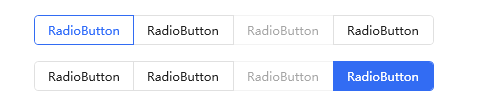
ButtonGroup控件中的子集RadioButton样式基类,不建议直接使用,常作为ButtonGroup中Item样式基类,同时与ButtonGroup控件配套使用
案例:
<!--内部Item样式为ButtonGroup控件自动附加-默认为水平方向item样式-->
<hc:ButtonGroup Margin="0,32,0,0">
    <RadioButton Content="RadioButton" IsChecked="True"/>
    <RadioButton Content="RadioButton"/>
    <RadioButton IsEnabled="False" Content="RadioButton"/>
    <RadioButton Content="RadioButton"/>
</hc:ButtonGroup>
<hc:ButtonGroup Margin="0,16,0,0" Style="{StaticResource ButtonGroupSolid}">
    <RadioButton Content="RadioButton"/>
    <RadioButton Content="RadioButton"/>
    <RadioButton IsEnabled="False" Content="RadioButton"/>
    <RadioButton Content="RadioButton" IsChecked="True"/>
</hc:ButtonGroup>
效果:
RadioGroup关联样式
| 样式Key | 用途 | 基类样式 |
|---|---|---|
| RadioGroupItemDefault | RadioGroupItem默认样式 | RadioGroupItemBaseStyle |
| RadioGroupItemHorizontalFirst | RadioGroupItem水平头样式(从左至右) | RadioGroupItemBaseStyle |
| RadioGroupItemHorizontalLast | RadioGroupItem水平尾样式(从左至右) | RadioGroupItemBaseStyle |
| RadioGroupItemSingle | RadioGroupItem单项样式 | RadioGroupItemBaseStyle |
| RadioGroupItemVerticalFirst | RadioGroupItem垂直头样式(从上至下) | RadioGroupItemBaseStyle |
| RadioGroupItemVerticalLast | RadioGroupItem垂直尾样式(从上至下) | RadioGroupItemBaseStyle |
案例:
单个RadioButton样式:
<RadioButton Style="{DynamicResource RadioGroupItemSingle}"
                 Margin="0,16,8,0"
                 Content="RadioGroupItemSingle"></RadioButton>
效果:

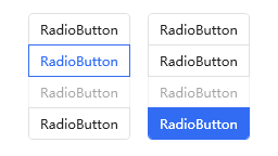
多个RadioButton垂直样式:
<StackPanel Orientation="Horizontal" HorizontalAlignment="Center">
    <hc:ButtonGroup Margin="0,16,8,0" Orientation="Vertical">
        <RadioButton Content="RadioButton" IsChecked="True"/>
        <RadioButton Content="RadioButton"/>
        <RadioButton IsEnabled="False" Content="RadioButton"/>
        <RadioButton Content="RadioButton"/>
    </hc:ButtonGroup>
    <hc:ButtonGroup Margin="8,16,0,0" Orientation="Vertical" Style="{StaticResource ButtonGroupSolid}">
        <RadioButton Content="RadioButton"/>
        <RadioButton Content="RadioButton"/>
        <RadioButton IsEnabled="False" Content="RadioButton"/>
        <RadioButton Content="RadioButton" IsChecked="True"/>
    </hc:ButtonGroup>
</StackPanel>
效果: