
38 lines
1.9 KiB
Markdown
38 lines
1.9 KiB
Markdown
---
|
|
title: DatePicker 日期选择器
|
|
---
|
|
|
|
# DatePickerBaseStyle
|
|
|
|
原生日期选择器默认样式,不推荐直接使用,应该始终被其它样式以BasedOn的方式使用。原生日期选择器如果未设置任何样式,则默认使用该样式:
|
|
|
|
- 默认样式
|
|
`<DatePicker SelectedDate="{x:Static system:DateTime.Now}"/>`
|
|

|
|
|
|
# DatePickerExtendBaseStyle : DatePickerBaseStyle
|
|
|
|
原生日期选择器扩展默认样式,不推荐直接使用,应该始终被其它样式以BasedOn的方式使用。
|
|
|
|
# DatePickerExtend : DatePickerExtendBaseStyle
|
|
|
|
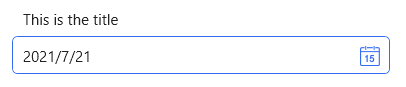
- 标题在上
|
|
`<DatePicker SelectedDate="{x:Static system:DateTime.Now}" Style="{StaticResource DatePickerExtend}" hc:InfoElement.Title="这是标题"/>`
|
|
|
|
|
|
- 标题在左
|
|
`<DatePicker SelectedDate="{x:Static system:DateTime.Now}" Width="380" hc:InfoElement.TitleWidth="140" hc:InfoElement.TitleAlignment="Left" Style="{StaticResource DatePickerExtend}" hc:InfoElement.Title="标题在左侧"/>`
|
|

|
|
|
|
{% note warning %}
|
|
标题在左时,为了多个输入框左侧对齐,需要设置标题宽度,标题宽度无需逐个设置,可在外部容器上统一设置。
|
|
{% endnote %}
|
|
|
|
- 标题在上,带有水印
|
|
[参见Combobox](https://handyorg.github.io/handycontrol/native_controls/comboBox/)
|
|
|
|
- 标题在上,带有水印,且为必填
|
|
[参见Combobox](https://handyorg.github.io/handycontrol/native_controls/comboBox/)
|
|
|
|
- 标题在上,带有水印,且为必填,同时自定义必填提示符
|
|
[参见Combobox](https://handyorg.github.io/handycontrol/native_controls/comboBox/) |