
77 lines
3.0 KiB
Markdown
77 lines
3.0 KiB
Markdown
---
|
|
title: VisualElement 可视化元素
|
|
---
|
|
|
|
# 属性
|
|
|
|
| 名称 | 用途 |
|
|
| -------------- | ---------------- |
|
|
| HighlightBrush | 设置控件高亮颜色 |
|
|
| Text | 设置文本内容 |
|
|
|
|
# 使用案例
|
|
|
|
## HighlightBrush 设置控件高亮颜色
|
|
|
|
```xml
|
|
<UniformGrid Margin="22,22,0,0" Rows="2" Columns="2">
|
|
<RadioButton Margin="10,10,0,0" Background="{DynamicResource SecondaryRegionBrush}"
|
|
Style="{StaticResource RadioButtonIcon}"
|
|
Content="RadioButton" IsChecked="True"
|
|
GroupName="radio1"/>
|
|
<RadioButton Margin="10,10,0,0" BorderThickness="1"
|
|
Style="{StaticResource RadioButtonIcon}"
|
|
hc:VisualElement.HighlightBrush="YellowGreen"
|
|
Content="RadioButton"
|
|
GroupName="radio2"/>
|
|
</UniformGrid>
|
|
```
|
|
|
|
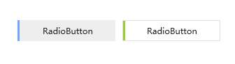
如下截图为一组选中状态时的高亮对比结果,左图为样式`默认颜色`,右侧为个人`自定义颜色`
|
|
|
|
|
|
|
|
## Text 设置文本内容
|
|
|
|
主要用于设置控件的辅助文本,当控件没有合适的属性用于显示文本时,可通过此附加属性在自定义样式中设置。
|
|
|
|
例如:当自定义进度条,需要显示文本时,本身缺少显示额外文本内容的属性,可以通过自定样式显示对应文本,以`Text`作为文本内容承载属性
|
|
|
|
自定义样式:
|
|
|
|
```xml
|
|
<Style x:Key="ProgressBarBaseStyle" TargetType="ProgressBar">
|
|
<Setter Property="controls:VisualElement.Text">
|
|
<Setter.Value>
|
|
.....忽略代码.....
|
|
</Setter.Value>
|
|
</Setter>
|
|
<Setter Property="Template">
|
|
<Setter.Value>
|
|
<ControlTemplate TargetType="ProgressBar">
|
|
<controls:SimplePanel x:Name="TemplateRoot">
|
|
....忽略代码....
|
|
<controls:SimplePanel HorizontalAlignment="Left">
|
|
....忽略代码....
|
|
<TextBlock HorizontalAlignment="Center" VerticalAlignment="Center" Foreground="{DynamicResource TextIconBrush}" Text="{Binding Path=(controls:VisualElement.Text),RelativeSource={RelativeSource TemplatedParent}}"/>
|
|
</controls:SimplePanel>
|
|
</controls:SimplePanel>
|
|
</ControlTemplate>
|
|
</Setter.Value>
|
|
</Setter>
|
|
</Style>
|
|
```
|
|
|
|
`xaml`中的使用:
|
|
|
|
```xml
|
|
<UniformGrid Margin="22,22,0,0" Rows="2" Columns="2">
|
|
<ProgressBar Style="{DynamicResource ProgressBarDanger}"
|
|
hc:VisualElement.Text="这是可视化文本"
|
|
Background="YellowGreen"></ProgressBar>
|
|
</UniformGrid>
|
|
```
|
|
|
|
效果:
|
|
|
|
 |