
143 lines
6.0 KiB
Markdown
143 lines
6.0 KiB
Markdown
---
|
|
title: Button 按钮
|
|
---
|
|
|
|
# ButtonBaseStyle : ButtonBaseBaseStyle
|
|
|
|
按钮默认样式,不推荐直接使用,应该始终被其它样式以BasedOn的方式使用。
|
|
|
|
{% note info %}
|
|
所有继承此样式的按钮都可以使用`IconElement`中定义的附加属性来控制按钮中几何图形的属性。
|
|
{% endnote %}
|
|
|
|
{% note info %}
|
|
所有继承此样式的按钮都可以使用`BorderElement.CornerRadius`附加属性来控制按钮的圆角大小。
|
|
{% endnote %}
|
|
|
|
{% note info no-icon %}
|
|
用例:
|
|
|
|
{% code %}
|
|
<StackPanel Orientation="Horizontal">
|
|
<Button Content="这是一个按钮"/>
|
|
<Button Content="这是一个按钮" Margin="10,0,0,0" controls:BorderElement.CornerRadius="15"/>
|
|
<Button Content="这是一个按钮" Margin="10,0,0,0" controls:IconElement.Geometry="{StaticResource GithubGeometry}"/>
|
|
</StackPanel>
|
|
{% endcode %}
|
|

|
|
{% endnote %}
|
|
|
|
# ButtonPrimary : ButtonBaseStyle
|
|
|
|
主要按钮
|
|
|
|
{% note info no-icon %}
|
|
用例:
|
|
|
|
{% code %}
|
|
<StackPanel Orientation="Horizontal">
|
|
<Button Style="{StaticResource ButtonPrimary}" Content="这是一个按钮"/>
|
|
<Button Style="{StaticResource ButtonPrimary}" Content="这是一个按钮" Margin="10,0,0,0" controls:BorderElement.CornerRadius="15"/>
|
|
<Button Style="{StaticResource ButtonPrimary}" Content="这是一个按钮" Margin="10,0,0,0" controls:IconElement.Geometry="{StaticResource GithubGeometry}"/>
|
|
</StackPanel>
|
|
{% endcode %}
|
|

|
|
{% endnote %}
|
|
|
|
# ButtonSuccess : ButtonBaseStyle
|
|
|
|
成功按钮
|
|
|
|
{% note info no-icon %}
|
|
用例:
|
|
|
|
{% code %}
|
|
<StackPanel Orientation="Horizontal">
|
|
<Button Style="{StaticResource ButtonSuccess}" Content="这是一个按钮"/>
|
|
<Button Style="{StaticResource ButtonSuccess}" Content="这是一个按钮" Margin="10,0,0,0" controls:BorderElement.CornerRadius="15"/>
|
|
<Button Style="{StaticResource ButtonSuccess}" Content="这是一个按钮" Margin="10,0,0,0" controls:IconElement.Geometry="{StaticResource GithubGeometry}"/>
|
|
</StackPanel>
|
|
{% endcode %}
|
|

|
|
{% endnote %}
|
|
|
|
# ButtonInfo : ButtonBaseStyle
|
|
|
|
信息按钮
|
|
|
|
{% note info no-icon %}
|
|
用例:
|
|
|
|
{% code %}
|
|
<StackPanel Orientation="Horizontal">
|
|
<Button Style="{StaticResource ButtonInfo}" Content="这是一个按钮"/>
|
|
<Button Style="{StaticResource ButtonInfo}" Content="这是一个按钮" Margin="10,0,0,0" controls:BorderElement.CornerRadius="15"/>
|
|
<Button Style="{StaticResource ButtonInfo}" Content="这是一个按钮" Margin="10,0,0,0" controls:IconElement.Geometry="{StaticResource GithubGeometry}"/>
|
|
</StackPanel>
|
|
{% endcode %}
|
|

|
|
{% endnote %}
|
|
|
|
# ButtonWarning : ButtonBaseStyle
|
|
|
|
警告按钮
|
|
|
|
{% note info no-icon %}
|
|
用例:
|
|
|
|
{% code %}
|
|
<StackPanel Orientation="Horizontal">
|
|
<Button Style="{StaticResource ButtonWarning}" Content="这是一个按钮"/>
|
|
<Button Style="{StaticResource ButtonWarning}" Content="这是一个按钮" Margin="10,0,0,0" controls:BorderElement.CornerRadius="15"/>
|
|
<Button Style="{StaticResource ButtonWarning}" Content="这是一个按钮" Margin="10,0,0,0" controls:IconElement.Geometry="{StaticResource GithubGeometry}"/>
|
|
</StackPanel>
|
|
{% endcode %}
|
|

|
|
{% endnote %}
|
|
|
|
# ButtonDanger : ButtonBaseStyle
|
|
|
|
危险操作按钮
|
|
|
|
{% note info no-icon %}
|
|
用例:
|
|
|
|
{% code %}
|
|
<StackPanel Orientation="Horizontal">
|
|
<Button Style="{StaticResource ButtonDanger}" Content="这是一个按钮"/>
|
|
<Button Style="{StaticResource ButtonDanger}" Content="这是一个按钮" Margin="10,0,0,0" controls:BorderElement.CornerRadius="15"/>
|
|
<Button Style="{StaticResource ButtonDanger}" Content="这是一个按钮" Margin="10,0,0,0" controls:IconElement.Geometry="{StaticResource GithubGeometry}"/>
|
|
</StackPanel>
|
|
{% endcode %}
|
|

|
|
{% endnote %}
|
|
|
|
# ButtonIcon : ButtonBaseStyle
|
|
|
|
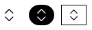
如果只想显示几何图形按钮,则推荐使用此样式。
|
|
|
|
{% note info no-icon %}
|
|
用例:
|
|
|
|
{% code %}
|
|
<StackPanel Orientation="Horizontal">
|
|
<Button Style="{StaticResource ButtonIcon}" Foreground="Black" controls:IconElement.Geometry="{StaticResource UpDownGeometry}"/>
|
|
<Button Style="{StaticResource ButtonIcon}" Background="Black" Foreground="White" controls:BorderElement.CornerRadius="15" controls:IconElement.Geometry="{StaticResource UpDownGeometry}" Margin="10,0,0,0"/>
|
|
<Button Style="{StaticResource ButtonIcon}" BorderThickness="1" BorderBrush="Black" Foreground="Black" controls:IconElement.Geometry="{StaticResource UpDownGeometry}" Margin="10,0,0,0"/>
|
|
</StackPanel>
|
|
{% endcode %}
|
|
|
|
{% endnote %}
|
|
|
|
# ButtonCustom
|
|
|
|
如果想完全自定义按钮的内容,则推荐使用此样式。`ButtonCustom`中的内容完全由你自己决定,另外,可以通过`BackgroundSwitchElement`中的附加属性切换背景:
|
|
|
|
{% note info no-icon %}
|
|
用例:
|
|
|
|
{% code %}
|
|
<Button Height="30" Padding="10,0" Background="Black" Foreground="White" Content="这是一个按钮" Style="{StaticResource ButtonCustom}" controls:BackgroundSwitchElement.MouseHoverBackground="Red" controls:BackgroundSwitchElement.MouseDownBackground="PaleVioletRed"/>
|
|
{% endcode %}
|
|

|
|
{% endnote %} |